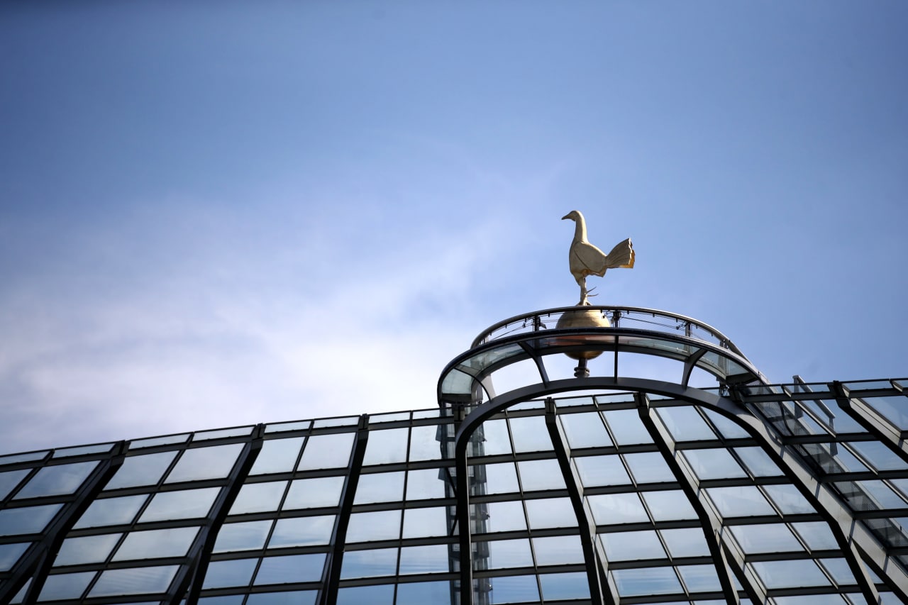
In a turn few saw coming, Tottenham Hotspur have recently unveiled their new crest.
In terms of what’s new to the crest, there is not much that can be said. The update sees the “Tottenham Hotspur” label present at the bottom of the famous ball and cockerel removed altogether.
It won’t be unreasonable to ask whether the alteration even justifies this being called a new crest, but for the sake of technicality we must call it as such.
In this article, we take a look at the many crests Tottenham have had over the years. More specifically, we will be using this source to track the club’s logos since the 1920s.
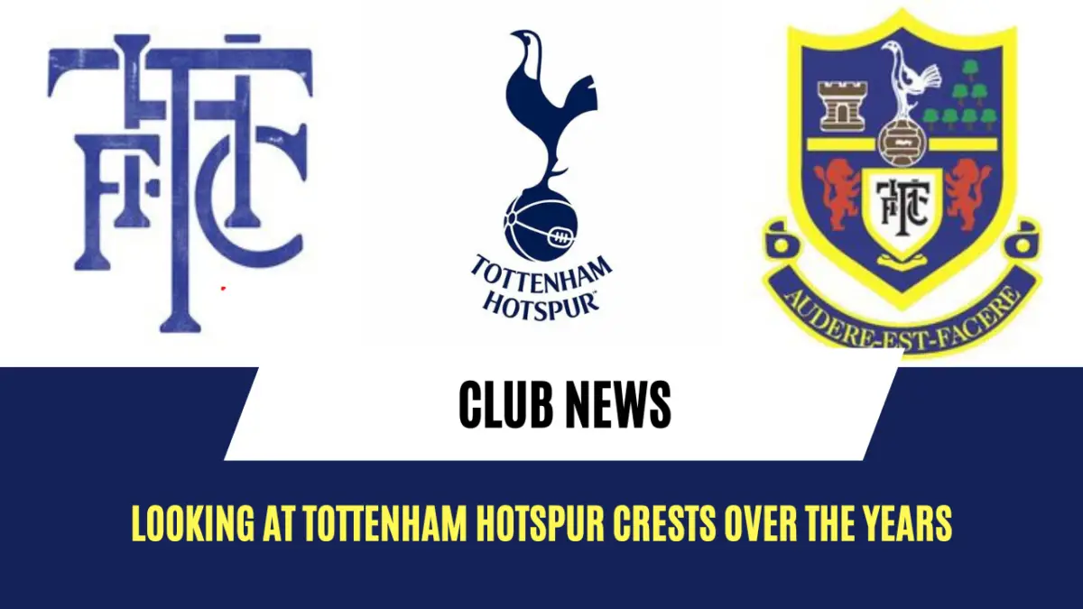
1921–1951
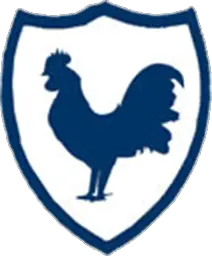
The first of the Tottenham crests is a good-old cockerel encased in a blue shield.
The cockerel has featured on the Tottenham crests since the 1921 FA Cup final. The Lilywhites have quite an association with the 15th century knight Henry “Harry Hotspur” Percy, whose family home is now part of the Tottenham Hotspur Foundation and whose documented interest in cock-fighting as well as the suggestion that he used to dug his spurs in his horses to force it to go faster brings us to the cockerel becoming the embodiment of the Spurs identity.
1951–1967
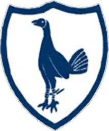
In the 1950s, the cockerel underwent a bit of a change. The new guy was given actual spurs at the back of its legs to further solidify the “Spurs” identity as well as a more vertical stance, with the blue shield changing shape a bit for accommodation.
1967–1983

The crest introduced in the late 1960s is rather similar to the one we are used to associate the club with. In fact, this one too has no name written on it. The blue shield that used to house the cockerel is gone, and the cockerel can now be seen balancing itself seamlessly on top of a ball.
1983–1995
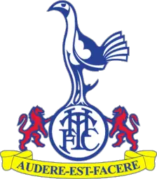
This crest introduced in 1983 was quite a walk-away from the previous designs. The cockerel here is white, silhouetted in the quintessential Spurs blue colour, now stands atop a white circle that encases the club initials “T.H.F.C.”, and has a red lion on either side. The words in the yellow ribbon underneath read “Audere est Facere“, which is Latin for “to dare is to do”—a phrase well-associated with the Lilywhites.
1995–1997
Spurs somewhat returned to their original cockerel-in-shield design in 1995. This time in a thicker shield, the cockerel from the previous design was retained, as was the THFC ball it stood upon.
1997–1999
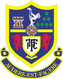
Spurs decided to go with another major crest design change two years later. The Latin phrase “Audere est Facere” returned on the crest, as did the two lions along with two new entrants in community landmarks. The shield was now made yellow, with the Spurs blue filling up the inside. The ever-present cockerel again stood on top of a ball rested upon a white shield housing the initials “T.H.F.C.”.
1999–2006

Spurs brought back the 1983–1995 logo design for a seven-year period in 1999.
2006–2024
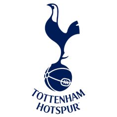
And here we come to the latest logo we have bid good-bye to. A minimalist design, this cockerel atop the ball with the club name underneath is what the current generation is used to associate with the club, and while the club name has now been taken off the logo to make even more minimalistic, the cockerel makes sure people recognise the club from its crest.
What do you make of the crest change? Let us know in the comments!

